Brand Guidelines
Everything you need to represent Lorikeet Security consistently across all channels and materials.
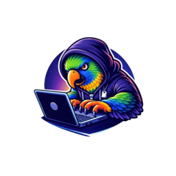
Logo
Our logo is the primary representation of the Lorikeet Security brand. Always use approved files and maintain clear space.
Minimum clear space: 1x the height of the logomark on all sides
- Use on solid backgrounds
- Maintain clear space
- Use approved color combos
- Link logo to homepage
- Stretch or distort
- Place on busy imagery
- Alter the logo colors
- Add drop shadows or effects
Colors
Our color palette is designed for dark interfaces and high-contrast readability. Click any hex value to copy it.
Brand Colors
Text & UI
Status & Feedback
Typography
We use Inter as our primary typeface for all UI and marketing, with JetBrains Mono for code and technical content.
Gradients
Gradients used across backgrounds, headers, and interactive elements.
Voice & Tone
How we sound across everything we write—from marketing to findings reports.
We know our craft. Speak with confidence backed by technical depth, not buzzwords.
No fluff, no enterprise jargon. Say what needs to be said clearly and move on.
Security is complex—our communication shouldn't be. Make it accessible without dumbing it down.
Lead with what to do, not what went wrong. Guide people toward outcomes.
- "We found 3 critical vulnerabilities in your API endpoints."
- "Your pentest report is ready—here's what to fix first."
- "Schedule a scan in under 60 seconds."
- "Leveraging our cutting-edge solutions to synergize your security posture."
- "Your comprehensive vulnerability assessment deliverable is now available."
- "Utilize our platform to initiate a vulnerability discovery workflow."
UI Patterns
Core design tokens used across all Lorikeet Security products.
Buttons
Cards
Panels
Badges
8px 7px 15px #081936
0 4px 12px rgba(186,86,99,0.3)
Font Awesome 6 Solid — 44x44px containers, 10px radius, tinted bg